The right rug can transform a room from a collection of furniture into a cohesive, polished space. Yet standing in a showroom or scrolling through endless online options, many people feel paralyzed by the choices. Should the rug match the sofa? Complement the walls? Introduce an entirely new color? The answer isn't one-size-fits-all, but understanding the principles of color coordination will give you the confidence to make decisions that work for your specific space.
Understanding the Role of Rugs in Interior Design
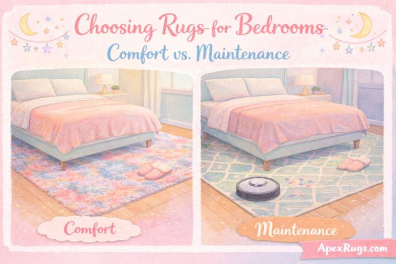
A rug serves multiple functions in a room's design hierarchy. It anchors furniture, defines conversation areas, adds warmth and texture, and perhaps most importantly, it acts as a bridge between your furniture and architectural elements like walls and flooring. When these elements work together harmoniously, they create visual flow that makes a space feel intentional and complete.
The mistake many people make is treating the rug as an afterthought—something to fill empty floor space after everything else is in place. In reality, the rug should be considered alongside your furniture and wall colors as part of an integrated color story. Whether you're starting from scratch or working with existing pieces, the principles of effective rug coordination remain the same.
The Foundation: Analyzing Your Existing Colors
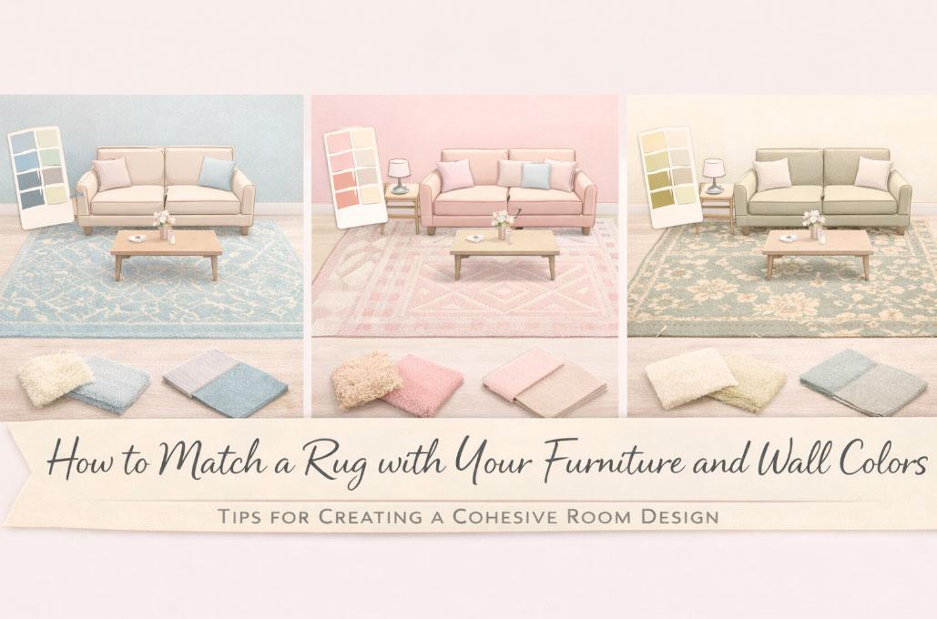
Before you can successfully match a rug to your space, you need to take stock of what you're working with. Start by identifying the dominant colors in your room. Your walls likely provide the largest color mass, followed by major furniture pieces like sofas, chairs, and curtains.
Look at your sofa fabric closely. Is it a solid color or patterned? If it's solid, note whether it's a warm or cool tone. A beige sofa might lean yellow (warm) or gray (cool), and this distinction matters when selecting complementary colors. If your furniture features patterns, identify the background color and the accent colors within the pattern.
Next, consider your wall color in different lighting conditions. Paint colors shift dramatically from morning to evening and under artificial light. A wall that appears warm cream in afternoon sunlight might read as flat beige under overhead lighting. Observe your walls at different times of day before making decisions based on how they look in a single moment.
Don't forget the undertones. This is where many rug-matching attempts go wrong. A "neutral" beige wall might have pink, yellow, or green undertones. A gray sofa might skew blue, purple, or brown. When undertones clash—say, a pink-based beige rug with a green-based beige wall—the combination feels off even though the colors seem similar on paper.
The Color Wheel Approach: Three Coordination Strategies
Monochromatic Matching
A monochromatic approach uses variations of a single color family across walls, furniture, and rugs. If you have gray walls and a charcoal sofa, a light gray or silver rug continues the theme while adding tonal variation. This strategy creates a sophisticated, calming environment that feels cohesive and intentional.
The key to successful monochromatic coordination is varying the intensity and value of your chosen color. If everything is the same shade of blue-gray, the room will feel flat and one-dimensional. Instead, use lighter values on larger surfaces like walls, medium values on major furniture pieces, and introduce both lighter and darker values in your rug to create depth.
Texture becomes especially important in monochromatic schemes. A hand-knotted wool rug in the same color family as your furniture will read differently than a flat-weave rug in an identical shade because of how it reflects light. Use these textural variations to add visual interest when color variation is minimal.
Complementary Coordination
Complementary colors sit opposite each other on the color wheel: blue and orange, red and green, yellow and purple. This approach creates energy and visual interest while maintaining balance. If you have navy blue walls, a rug with warm orange or rust tones will create vibrant contrast that makes both colors appear more saturated.
This doesn't mean your rug should be solid orange if your walls are blue. More often, you'll see this principle applied through patterns that incorporate complementary colors. A predominantly blue rug with orange accents, paired with blue walls and neutral furniture, creates dynamic visual interest without overwhelming the space.
The intensity of your complementary pairing matters. Bright royal blue walls with a bright orange rug creates a bold, energetic space appropriate for a playroom or creative studio. Softer approaches—dusty blue walls with terracotta accents in the rug—deliver complementary contrast with more subtlety, suitable for living rooms and bedrooms.
Analogous Coordination
Analogous colors sit next to each other on the color wheel: blue, blue-green, and green, for example, or red, red-orange, and orange. This approach creates harmony and flow because the colors share common undertones. If you have sage green walls and a teal sofa, a rug that incorporates both colors plus some warmer greens creates a cohesive, nature-inspired palette.
Analogous schemes feel inherently peaceful because the eye moves easily between related colors. This makes it an excellent approach for bedrooms, reading rooms, and other spaces designed for relaxation. The close color relationships create unity without the potential monotony of a strictly monochromatic approach.
When working with analogous colors, vary the saturation and value to prevent the space from feeling too matchy. If your walls are a pale blue-green and your sofa is a medium blue, your rug might incorporate both these colors plus a deeper navy or a lighter aqua to create tonal range within the analogous family.
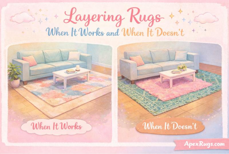
Pattern Considerations: Balancing Busy and Calm
The pattern density of your rug should balance with patterns already present in your space. If you have solid-colored walls and furniture, a boldly patterned rug can serve as the room's focal point, introducing visual interest and personality. Conversely, if your sofa features a busy floral print and your walls have textured wallpaper, a solid or subtly patterned rug prevents visual chaos.
Many successful room designs follow a pattern hierarchy: one bold pattern, one medium pattern, and one subtle pattern or solid. If your curtains feature a large-scale geometric print, your rug might have a smaller-scale pattern in coordinating colors, while your sofa remains solid. This creates visual interest without competition.
The scale of patterns matters as much as their presence. A large room can accommodate a large-scale pattern in the rug, while a small room typically benefits from smaller-scale patterns or solids that don't visually fragment the floor space. A massive Persian rug with 12-inch medallions might overwhelm a 10x12 bedroom but look perfectly proportioned in a spacious living room.
Color distribution within patterns also affects coordination. A rug might be described as "blue" but actually feature 30% blue, 40% cream, 20% rust, and 10% brown. When matching this rug to your room, consider all these colors, not just the dominant one. That rust accent in the rug could pull from a rust throw pillow on your sofa, creating connection through the secondary color rather than the primary.
Working with Neutral Foundations
Neutral rugs—those in beige, gray, cream, taupe, or brown—offer versatility and longevity. They work with multiple furniture configurations and allow you to change accent colors seasonally without replacing the rug. However, "neutral" doesn't mean "goes with everything," and careful attention to undertones remains essential.
Warm neutrals (beige, cream, tan, warm gray) pair naturally with warm-toned furniture and walls. If your walls are a warm white with yellow undertones and your leather sofa is caramel brown, a warm beige or cream rug reinforces the cozy, inviting atmosphere. These warm neutrals complement wood furniture with golden or orange tones, making them ideal for spaces with traditional or rustic aesthetics.
Cool neutrals (gray, greige, taupe with gray undertones) align with contemporary and modern design schemes. They pair beautifully with cool-toned walls, chrome fixtures, and furniture in grays, blacks, or cool blues. A gray rug with subtle blue undertones enhances a room with pale blue-gray walls and a slate-colored sofa, creating a sophisticated, cohesive look.
The "greige" territory—that ambiguous space between gray and beige—can be tricky. Some greiges lean warm, others cool, and this affects compatibility with your existing colors. Hold samples against your walls and furniture in your actual lighting conditions. A greige that looks perfect in the store might clash with your warm beige walls at home if it's actually a cool-toned greige.
Introducing Accent Colors Through Rugs
One of the most effective uses of a rug is introducing a new accent color that picks up from smaller elements in the room. Perhaps your walls are white, your sofa is gray, but you have teal throw pillows and a teal vase on the mantle. A rug that incorporates teal—even as a secondary color—ties these elements together and makes the color choice feel intentional rather than random.
This approach works particularly well when you want to add color without the commitment of painting walls or replacing large furniture pieces. A vibrant rug can transform a neutral room, introducing personality and warmth. Since rugs are more easily changed than sofas or wall colors, they offer a lower-risk way to experiment with bolder palettes.
When using the rug to introduce new color, ensure the color appears at least one other place in the room. If your rug is the only source of coral in an otherwise blue and white room, it will look disconnected. Add coral pillows, artwork with coral accents, or coral-toned accessories to create visual rhythm that carries the eye around the space.
The proportion of the accent color in your rug matters. If you want coral to feel like an accent rather than a dominant color, choose a rug where coral appears as 10-20% of the pattern, with the remaining colors being your room's existing neutrals or primaries. This creates connection without overwhelming the space with a color that appears nowhere else in large quantities.
The Impact of Rug Texture and Material
The material and texture of a rug affect how color appears in your space. A high-pile shag rug in navy blue will look different from a flat-weave kilim in the same navy because of how light interacts with the fibers. The shag's depth creates shadows and highlights that make the color appear more dynamic, while the flat-weave presents a more uniform color field.
Wool rugs tend to have natural color variation within the fibers, giving them a heathered appearance that adds depth. This quality makes wool particularly forgiving in color matching—the natural variation means the rug can pick up several tones from your room. A gray wool rug might contain fibers that range from charcoal to silver, allowing it to bridge a dark gray sofa and light gray walls.
Silk rugs have a luminous quality that makes colors appear more saturated and rich. The sheen catches light, creating subtle color shifts as you move around the room. This works beautifully in formal spaces but might feel too precious for high-traffic family rooms. The color intensity of silk means that a silk rug in a given color will have more visual impact than a cotton rug in the same shade.
Natural fiber rugs—jute, sisal, seagrass—bring earthy brown and tan tones that work as neutrals in most schemes. These work particularly well in coastal, organic, or casual design styles. Their texture adds interest while their neutral palette ensures compatibility with most furniture and wall colors. They do, however, skew warm, so they're better suited to warm color schemes than cool contemporary spaces.
Room-Specific Considerations
Living Rooms
Living rooms often feature the most furniture and the greatest color complexity, making rug coordination both more challenging and more important. The rug should be large enough that at least the front legs of all furniture pieces rest on it, creating a unified conversation area.
With multiple furniture pieces, you have more colors to consider. Your sofa might be one color, your chairs another, and your ottoman a third. Look for a patterned rug that incorporates multiple colors from these pieces, or choose a solid rug in a color that complements the largest furniture piece while not clashing with the others.
Living room walls often serve as a backdrop, so a common approach is to match the rug's background color to the wall color (or a close variation) while allowing pattern colors in the rug to pull from furniture. This creates grounding while adding visual interest at floor level.
Bedrooms
Bedroom rugs typically live in a simpler color environment—walls, bed frame, bedding—making coordination more straightforward. The rug can either blend with the serene, restful palette or provide a pop of color and pattern that energizes the space.
If your bedding is patterned, consider a solid rug that picks up one of the colors from the bedding. If your bedding is solid, a patterned rug can introduce visual interest without competing with the bed, which should remain the room's focal point.
Bedroom wall colors are often softer and more muted than living areas, creating an opportunity for the rug to add depth. If you have pale blue walls and white bedding, a rug in deeper blue creates tonal variation while maintaining the room's peaceful atmosphere.
Dining Rooms
Dining room rugs need to be large enough to accommodate chairs even when pulled out from the table, which often means a bigger rug than you'd initially consider. This large surface area makes the rug's color particularly impactful in the room's overall palette.
Dining room furniture is often wood, which introduces brown tones regardless of wall color. Consider how the rug's colors interact with both the wall color and the furniture's wood tone. A rug with warm brown accents can harmonize with cherry dining chairs, while a cool gray rug might clash with the same warm wood.
If your dining chairs are upholstered, you have fabric color to consider as well. A common approach is choosing a rug that features both your wall color and your chair fabric color, creating connection between the architectural elements and the furniture.
Testing Before Committing
Color matching from memory or small online swatches leads to disappointment. Most reputable rug retailers offer samples or have generous return policies. Order samples of your top contenders and live with them in your space for several days.
Place the samples in the actual location where the rug will go, and observe them at different times of day. Morning light, afternoon sun, evening artificial light—each reveals different aspects of the color and how it interacts with your walls and furniture. A color that looks perfect at noon might look dull and muddy at 8 PM under your current lighting.
Photograph the samples in place. Sometimes the camera reveals color relationships that your eye misses in person. Review the photos to see which option creates the most cohesive overall look.
If possible, bring your wall paint color and furniture fabric samples with you when shopping for rugs in person. Viewing everything together under the store's lighting helps, though remember that your home lighting will differ. Trust relationships that work across multiple lighting conditions.
Final Thoughts on Color Confidence
Matching a rug to your furniture and walls isn't about finding one "right" answer—it's about understanding color relationships and making informed choices that reflect your aesthetic goals. A successful combination creates visual harmony without being overly coordinated or matchy. The best rug choices feel both intentional and natural, grounding your furniture while adding personality to the space.
Start with the fundamentals: identify your existing colors and their undertones, determine which coordination approach suits your style, and consider pattern scale and distribution. Test your choices in real conditions before committing. Trust your eye while also understanding the principles that make certain combinations work better than others.
The perfect rug makes your furniture look better, your walls more intentional, and your entire space more cohesive. It's worth the time and attention to get it right.